|
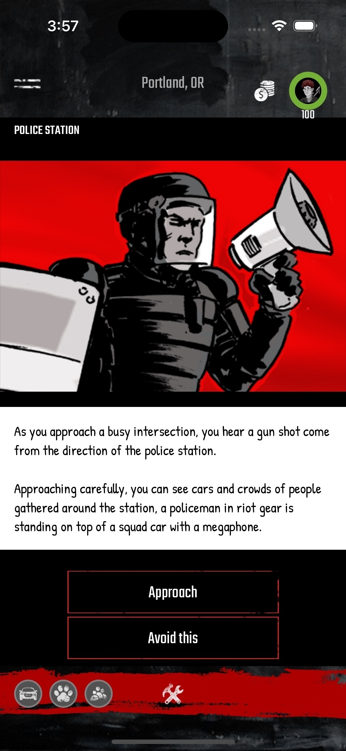
When the original Survivor Z launched, there were only a couple of different screen sizes and as such the interface was designed around what we would now consider to be very small screens. As we are looking at what this new platform can be, we are trying to re-imagine and improve wherever we can, and one of those areas is around screen real estate.
One of the big things that we've been working on this week is trying to imagine an interface that can still provide the richness and simplicity of the original while also taking advantage of the ability to display more information and controls to the user. One of the primary ways we are looking is centered around dynamic resizing of options, buttons and text. If we can create an intelligent renderer, players can see more of the text without obscuring imagery. An intelligent renderer leaves more room for bigger buttons and more controls. In short, smarter layouts are better. Of course this doesn't mean that we don't still have to be smart about what we are building. One of the big paradigms that we are trying to embrace is bottom oriented controls. Because phones are larger now, people's fingers and thumbs tend to be located at the very bottom of the device. Trying to drive user input to the lower portion of the screen makes life simpler and easier for people because they don't have to reach for commonly used buttons. The original version of the game did actually embrace a version of this, but as time went on, the buttons migrated further up towards the center of the screen. In short, we want to reclaim the bottom of the phone for most of these inputs as well as create an intelligent layout renderer. We feel this will simply make the game more enjoyable for everyone. |
Dev Blog Diary: 3/10/2023
Read other posts